Circular progress bar
Create an SVG progress bar component
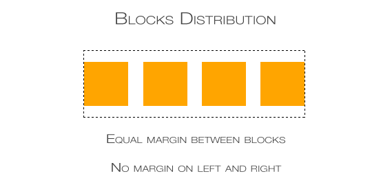
While working on a layout with grids, a certain problem may arise. Let’s say we want to put some block elements equally in a line, with margins between them but without left margin of the first and right margin of the last element. The picture below illustrates what we want to achieve.
You can do this by setting class names or ids on elements and then give the first and the last appropriate margins values but it’s not the coolest and cleanest solution. Instead let’s use something more interesting.
Our basic HTML will be like that:
<div id="container">
  <div></div>
  <div></div>
  <div></div>
  <div></div>
</div>
It’s just a simple container div with four divs that we want to position inside. We don’t need to give them any class or id. Also this solution applies to other block and block-ish elements, such as images.
Now let’s write some CSS.
#container {
  text-align: justify;
}
#container > div {
  width: 100px; /* Declare your value. Can be in relative units. */
  display: inline-block;
  vertical-align: top;

  /* IE fix. */
  *display: inline;
  zoom: 1;
}
#container:after {
  content: "";
  width: 100%;
  display: inline-block;
}
We set the container’s text-align to justify and the inside divs’ display to inline-block so they’ll behave like inline elements and can be justified. The vertical-align: top is there to make sure that if one of those divs will be higher than other, all divs will be aligned to the top and not—as it is in default— to the bottom of the #container.
Now the layout will work only with the :after pseudo element. It is required because of the justification specification: the last line in paragraphs is not justified. In our case that last line would be the line with the divs. So we need to create a fake last line with :after pseudo element so the previous one (with divs) will get justified. You could also use an additional element (eg. span) but it will result in a code redundancy
And with that we have a rather fluid layout (fluid margins), that doesn’t require too much syntax and the border divs are aligned to the left and right without unnecessary margin. The only headache will be to make it totally responsive on smaller devices. You’ll probably need to change the divs’ display to the default state and float them, so only two or one of them will stay in the line. For that you will either need to use :nth-child in the CSS or set classes for the divs.