Circular progress bar
Create an SVG progress bar component
The backdrop-filter CSS property applies one or more filters to the area behind an element. This property can be used to create a frosted glass effect, or to apply color and alpha channel effects to the background of an element.
This property is a sibling of the filter property. The only difference is that the filters here are applied to the element’s background, rather than to the element itself.
Blur creates a glassy effect for the background behind the blurred element. It can ad a small blur using values closer to 1 or 2 pixels, and a very blurred effect using larger values.
The unit of measure is pixel (px). Values go from 0 up.
blur(1px)
blur(10px)
blur(50px)
blur(100px)
Used to dim or brighten the background. Values below 100% makes the background darker, up to the point of being black at 0%. Values above 100% makes the background brighter. The upper limit is not really defined, but with the higher values, the background is getting closer and closer to being white.
Unit of measure is percentage (%). Values go from 0 up.
brightness(0%)
brightness(10%)
brightness(50%)
brightness(100%)
brightness(200%)
Contrast manipulates the contrast of the background. Values below 100% makes the background less contrasted, up to the point of being completely gray at 0%. Values above 100% makes the background more contrasted.
Unit of measure is percentage (%). Values go from 0 up.
contrast(0%)
contrast(10%)
contrast(50%)
contrast(100%)
contrast(200%)
Grayscale removes the color from the background and creates a monochromatic effect. Values go from 0% (no grayscale) to 100% (completely grayscale).
grayscale(10%)
grayscale(50%)
grayscale(100%)
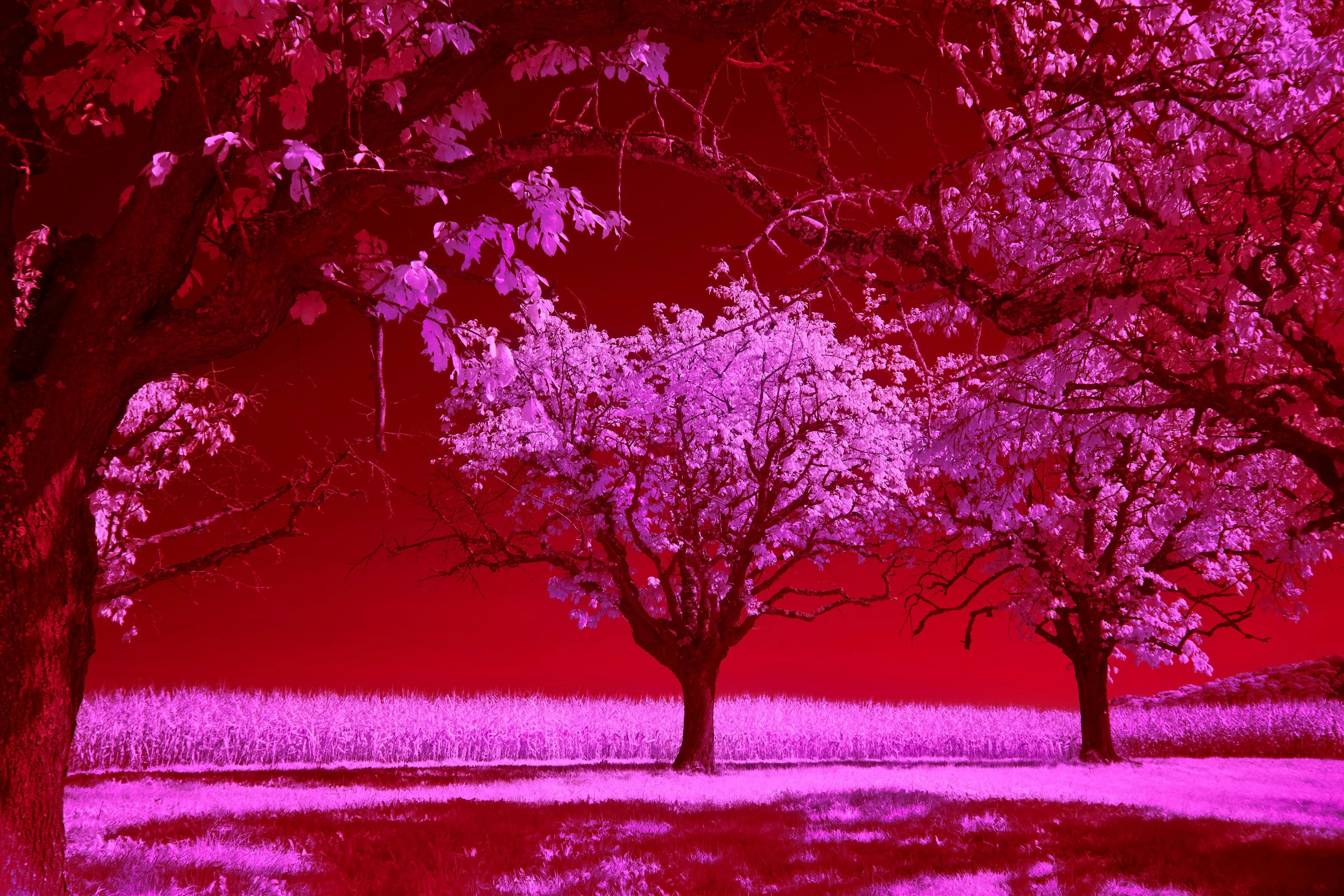
Hue rotate changes the color of the background. The value is an angle in degrees, and it can be positive or negative. The color wheel is used as a reference, and the angle is the amount of rotation applied to the colors.
hue-rotate(90deg)
hue-rotate(180deg)
hue-rotate(270deg)
Inversion of color allows to create an old photography negative effect on the background. The value is a percentage, and it goes from 0% (no inversion) to 100% (completely inverted). 50% inversion creates just a gray block.
invert(10%)
invert(50%)
invert(100%)
Another old-school effect. Values goe from 0% to 100%.
sepia(10%)
sepia(50%)
sepia(100%)
Saturate increases or decreases the color saturation of the background. Values go from 0% (completely desaturated) to 100% (no change) and up.
saturate(10%)
saturate(50%)
saturate(100%)
saturate(200%)
saturate(1000%)
Backdrop filter can use an SVG as a source of the filter. The value of the property should be a URL to the SVG’s <filter> element.
While all the filters above are presented one by one, filters can be used together by declaring them with a space. For example, to make the inverted and blurred background, use backdrop-filter: invert(100%) blur(10px).